Sunday, July 29, 2007
Too Beautiful for This World: "The World's Finest Theater" (Part one of a series of rants)
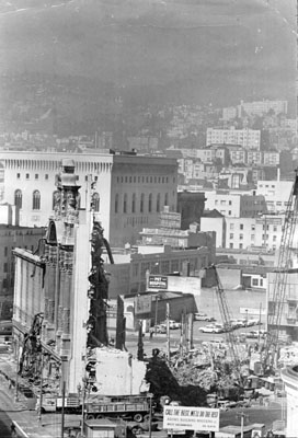
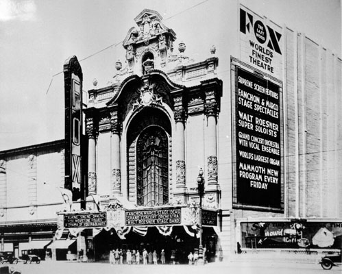
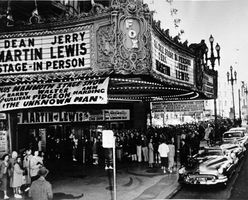
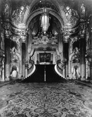
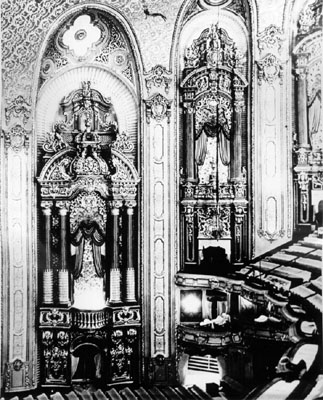
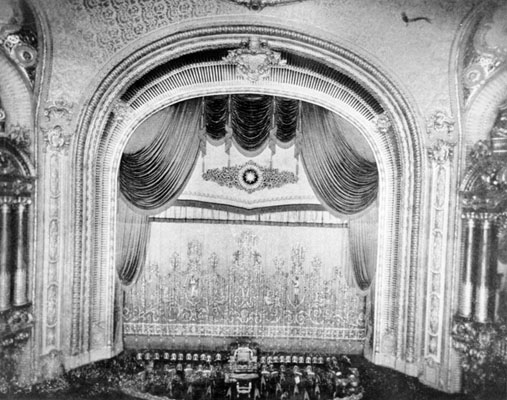
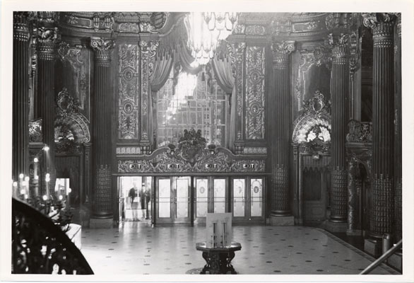
These photos are all of the Fox Theater, designed by Thomas Lamb, located on Market and 9th, built in 1929, the self-proclaimed "World's Finest Theater!" Based on these photos, I'm pretty sure they were right. It's all so baroque! Can you imagine going to see a film in a theater like this? I mean, the Castro is alright and all, but man... (My father remembers seeing some sort of Boris Karloff movie at the Fox with his cubscout troop, probably in the late 50s. "It was really cool," he says). Unfortunately, like many theaters in this town, the Fox was just too beautiful for this world, and in 1963 it was torn down.
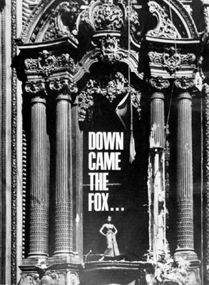
I don't even want to write about what it was replaced with. It's called Fox Plaza and it's the ugliest fucking building in San Francisco. Sigh.
Friday, July 27, 2007
Even Boring Stuff at Least Used to Look Cute
Back in ye olden days, even boring stuff like the sign for a parking garage had some style. Like this one, located on the San Francisco Marketplace building, which is on Market and, uh, 9th or something:
Anyway, the point is, it seems like everything that is built nowadays, especially buildings/structures which serve a semi-utilitarian purpose (government buildings, hospitals, parking garages, etc.) are made as boring and ugly as humanly possible. It's like, Slab Of Concrete, Slab of Concrete, window, repeat, ad nauseum. You know? I mean, a parking structure is not an interesting place to be. But do they really need to be so aggressively ugly?
Labels:
art deco,
downtown,
market street,
old neon signs,
typography
Thursday, July 19, 2007
What's up with the Hibernia Bank?
I was talking to a friend today, and he mentioned the Hibernia Bank building. "What's up with that old bank, the one with the kinda weird name?" he asked. Well, uh, I did a little (very little) research and here's what I came up with: First off, Hibernia is the Roman Latin name for Ireland. The Hibernia Bank Building in San Francisco is located on the corner of McAllister and Jones, right next to Market Street, in the always glamourous Civic Center area. Hibernia National Bank itself was a New Orleans-based institution (founded 1870, natch), and was bought out by Capitol One in 2005. As for the actual building here in SF, I really don't know what the deal is with it. For as long as I can remember, it's been abandoned and fenced in. Which really seems like a waste to me. I bet the inside is really cool and old! Also, with a name like "Hibernia," you could open some sort of swingin' clothing store that doubled as a night club. That is, if it was still 1965. It also reminds me of the local sex/relationship show called "Hibernia Beach" that used to be on LIVE 105 at like 1am back when I used to listen to LIVE 105, ie, over 10 years ago. Anyway, if anyone knows anything about this building, like why it's all boarded up, or how long it's been abandoned, or if we're wrong and there's actually something totally awesome going on in there (and no, I don't mean a meth lab), let us in on it.
Tuesday, July 17, 2007
Ex Round Table, Market Street
Above is a building on Market Street, between 7th and 8th. It has faces carved allover it, which you will see if you enlarge the picture. Like lots of gorgeous old buildings, the bottom has been hollowed out (probably the inside too) to make way for something else beautiful and special- a now abandoned Round Table Pizza. In the first photo, you can see the remains of the carved columns peeking out from behind the boarded-up exterior. Who knows what might be next? A store selling Nike Dunks? Or maybe they'll just knock it down.
Labels:
carving,
downtown,
faces in buildings,
market street,
reliefs
Sunday, July 15, 2007
Discolandia
This is a little record store on 24th street in the Mission (from about Mission to Potrero)- an area that is rapidly gentrifying. 24th street is full of trees and old storefronts and businesses and great architecture, and shall feature prominently in Little San Francisco, at least until all the hipsters boring it up, with their American Apparels and expensive cocktails and whatnot.
Labels:
gentrification,
old neon signs,
record stores,
The Mission
Subscribe to:
Posts (Atom)